Data visualisation is the act of presenting information in a visually appealing way, engaging with the viewer in order for them to understand the data better. The human brain processes information shown visually quicker than complex data and allows the user to grasp difficult concepts or identify new patterns they might not see otherwise (SAS Institute INC, 2016). There are different types of data visualisation techniques available to designers, which can both inform or mislead viewers.
This is particularly evident in Rafael Lozano-Hemmer’s Level of Confidence (Lozano-Hemmer, 2015). The technique of data visualisation that Level of Confidence (Lozano-Hemmer, 2015) uses is a powerful method, utilising an algorithm to identify patterns in the public’s facial features to match them with the 43 missing students’. This method evokes an emotional response from viewers, informs them of the information and makes it more likely for them to connect with the project.
This emotional example of data visualisation uses bio metric surveillance algorithms to scan viewer’s faces to identify who the person looks most like out of the 43 students who went missing and are presumed dead in Mexico. Although there will never be an exact match to a face, the art project is there to remind viewers of the tragedy and commemorate the relentless search for the missing students (Lozano-Hemmer, 2015). Bostock observes that algorithms are also a reminder that visualisation is more than a tool for finding patterns in data and that visualisation leverages the human visual system to augment human intellect, which we can use to better understand important abstract processes, and perhaps other things, too (Bostock, 2014).
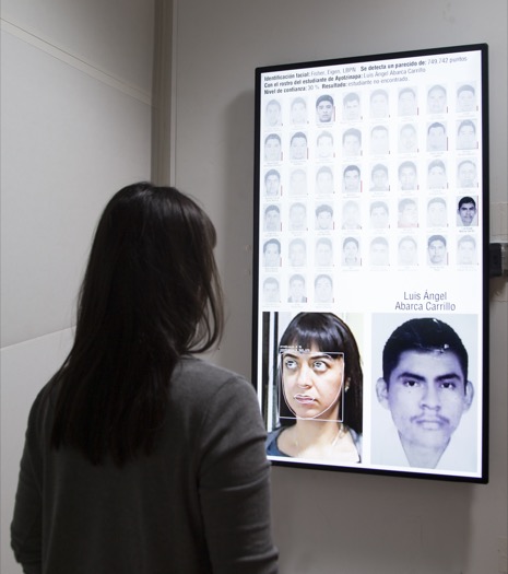
Level of Confidence, Rafael Lozano-Hemmer (2015) http://www.lozano-hemmer.com/level_of_confidence.php
Presenting data in a way that humans can connect with and understand on a personal level is sometimes more beneficial than using words and figures as it is more likely to resonate with the viewer, this is likely due to the fact that our brains are wired to make sense of visual images (Reas, McWilliams, & Barendse, 2010, p. 121).
Another helpful technique is time-series data visualisation, which is when data is collected over a long period within a single image, compressing many moments into a single frame (Reas, McWilliams, & Barendse, 2010, p. 135). This technique is effectively used in the animated visuals which combine the data through motion, helping the viewer understand what they are looking at. Time-series visualisation is more effective in this case than if it was presented in word form.
Essentially, it helps when data is presented as an engaging image or video rather than a mind-numbing word list, for example. Designers need to be aware of how they are presenting their data, so it not only reveals the hidden complex information but displays it in a way that viewers can easily engage with.
References
Bostock, M. (2014, June 26). Visualizing Algorithms. Retrieved July 24, 2017, from Mike Bostock: https://bost.ocks.org/mike/algorithms/
Lozano-Hemmer, R. (2015). Level of Confidence. Retrieved July 23, 2017, from Rafael Lozano-Hemmer: http://www.lozano-hemmer.com/level_of_confidence.php
Reas, C., McWilliams, C., & Barendse, J. (2010). Form+Code in Design, Art, and Architecture. Retrieved July 23, 2017, from eBook Central: http://ebookcentral.proquest.com.ezproxy.lib.swin.edu.au/lib/swin/detail.action?docID=3387346
SAS Institute INC. (2016). Data Visualization. Retrieved July 23, 2017, from SAS Institute INC: https://www.sas.com/en_au/insights/big-data/data-visualization.html
